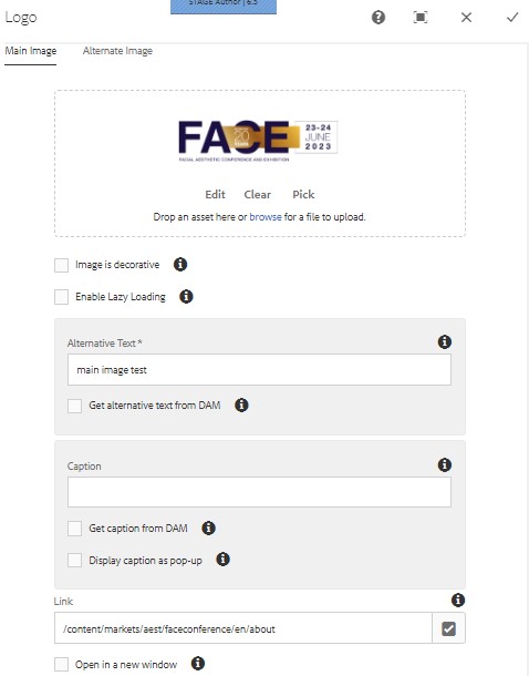
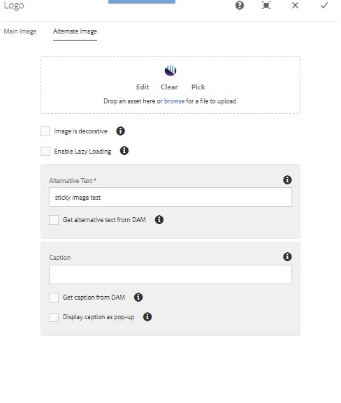
Logo Component
The logo component is a specialty component because it achieves something the standard image component used in the navigation can't do: display an alternative logo upon activating the sticky navigation.
There are event sites that use tall images and if sticky navigation is enabled, then this image will take up a lot of real estate on the page.
Using the Logo Component, you can have a primary logo in its original height but have an alternative upon scrolling down.
Sample page: https://informa-stage65.adobecqms.net/content/markets/aest/faceconference/en/home.html
This component was based off the image component so you'll see options for images, the only ones to pay attention on are:
Main Image and Alternative Image drop asset area
Alternative Text
Link
Copyright © 2025. All rights reserved. Informa Markets, a trading division of Informa PLC.