Separator
The Separator component allows for the configuration and display of a separator item on a page.
The Separator Component allows the content author to easily create a horizontal rule as a break between content to better organize information on a page.
Examples

Authoring
Configure Dialog
The separator component does not have any dialog options.
Styles
The separator comes with a number of available styles that will be customized for your specific site and theme. You can use the styles selector to pick a style for your separator.
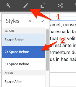
Available Styles
- Space Before
- 2X Space Before
- 3X Space Before
- Space After
- 2X Space After
- 3X Space After
Vertical Spacing Update
Because the Vertical Spacing option can be found in the Layout option, we have removed the Styles from the Separator Component system to reduce redundency.
Copyright © 2025. All rights reserved. Informa Markets, a trading division of Informa PLC.