Popopen
The Popopen component allows for the configuration and display of a popopen item on a page.
The popopen component when activated will slide down to expose content. The component can be activated again to slide up hidding the content.
Examples


Authoring
Configure Dialog
The configure dialog allows the content author to define the popopen and how it will behave and appear for a visitor to the page.
Properties Tab
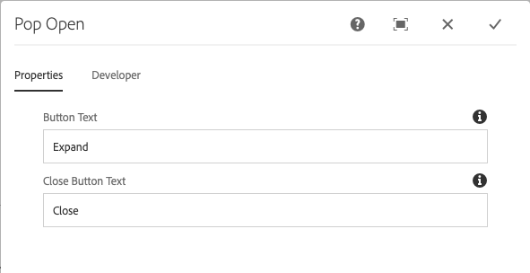
- Button Text - The text to be displayed to open the Popopen when it is closed.
- Close Button Text - The text to be displayed to close the Popopen when it is open.
Styles
The popopen comes with a number of available styles that will be customized for your specific site and theme. You can use the styles selector to pick a style for your popopen.
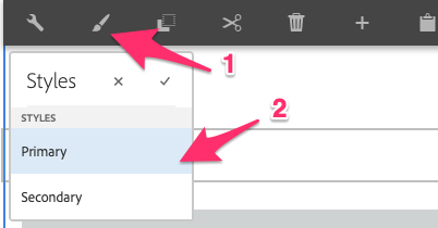
Available Styles
- Primary
- Secondary
Copyright © 2025. All rights reserved. Informa Markets, a trading division of Informa PLC.