Button
Usage
The Button component allows for the configuration and display of a button item on a page.
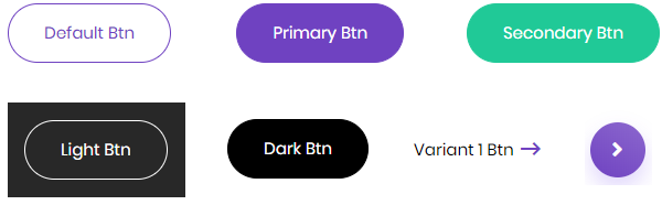
Example
From left to right: Default, Primary, Secondary, Light, Dark, CTA Variant, CTA Variant 2
Authoring
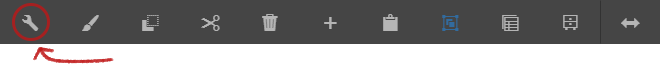
Configure Dialog
The configure dialog allows the content author to define the button and how it will behave and appear for a visitor to the page.
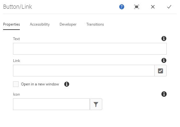
Properties Tab
| Property | Description |
|---|---|
| Text | The text to display on the button |
| Link | Link to a content page within AEM, an external resource, or an anchor. Use the Selection Dialog to choose a path within AEM. |
| Icon | Identifier for displaying an icon in the button |
Note
You can have a button that is either a combination of the following properties:
- Text, link, and icon.
- Text and link.
- Link and icon.
You also have the option to open the link in a new window.
Using Icons
Click the icon picker to incorporate an icon to the button.
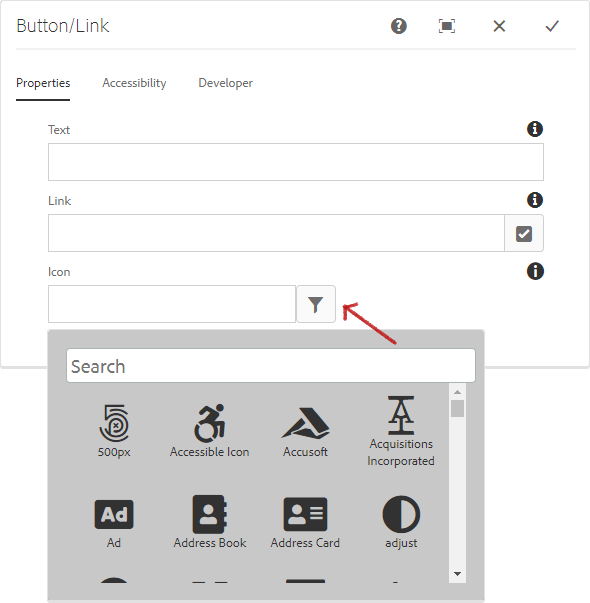
Styles
The button comes with a number of available styles that will be customized for your specific site and theme. You can use the styles selector to pick a style for your button.
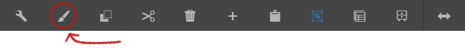
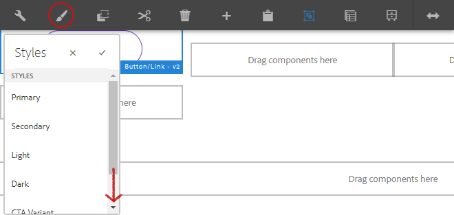
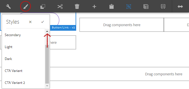
Available Styles
- Primary
- Secondary
- Light
- Dark
- CTA Variant
- CTA Variant 2
Copyright © 2025. All rights reserved. Informa Markets, a trading division of Informa PLC.