Bride Show Dubai is part of the Informa Markets Division of Informa PLC
This site is operated by a business or businesses owned by Informa PLC and all copyright resides with them. Informa PLC's registered office is 5 Howick Place, London SW1P 1WG. Registered in England and Wales. Number 8860726.
Countdown
Usage
The Countdown component allows for the configuration and display of a countdown item on a page.
Examples
From top to bottom: Default, Variant 1, Variant 2, Variant 3. It can have a different look provided that the mockup design is within the component’s markup.


Authoring
Configure Dialog
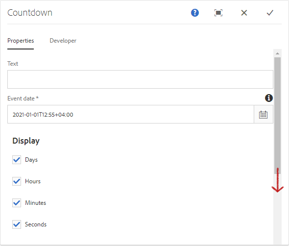
The configure dialog allows the content author to define the countdown and how it will behave and appear for a visitor to the page.

Properties Tab
| Field | Description |
|---|---|
| Text | Text that shows at the beginning of the countdown. |
| Event Date | The date and time to countdown towards. It uses the time zone provided by the Author's location. |
| Display | You can choose to display a combination of either Days, Hours, Minutes, or Seconds. |
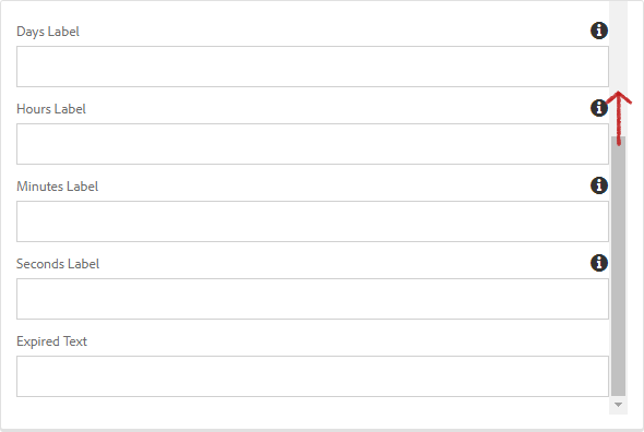
| Days Label | The custom label for displaying Days. |
| Hours Label | The custom label for displaying Hours. |
| Minutes Label | The custom label for displaying Minutes. |
| Seconds Label | The custom label for displaying Seconds. |
| Expired Text | Text to be displayed when the countdown has expired. |
NOTE
The Event Date uses the time zone provided by your browser.
Event Date and Time configuration
If I was a marketer based in Dubai and the countdown I was configuring for was a show in the UK, the steps I would need to take are the following:
Open the dialog window of the countdown component
In the T00:00 section of the Event Date*
Calculate the time difference between the show start time (UK time) to your local time (Dubai Time)
If the show starts at 9 AM (T9:00) UK time, then the author in Dubai needs to configure it to T12:00 (for the 3-hour difference)
This will now accurately show the start time
Do not edit the time zone (+4:00)
Please note that when creating an event, the countdown component will countdown based on author's time zone at the time of editing. If the event timezone is in a different timezone from the Author's, the timezone will need to be edited accordingly.


Styles
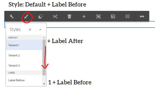
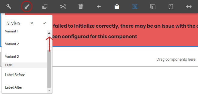
The countdown comes with a number of available styles that will be customized for your specific site and theme. You can use the styles selector to pick a style for your component.


Available Styles
- Variant 1
- Variant 2
- Variant 3
Label Styles
- Label Before
- Label After