Modal
The Modal component allows for the configuration and display of a modal (lightbox) item on a page.
This Documentation Is Still In Progress
The modal component provides a link for the user to click that will open a full screen modal or lightbox.
The modal can be used to display specific content, or other pages on the site in a modal window.
Examples

Authoring
Configure Dialog
The configure dialog allows the content author to define the modal and how it will behave and appear for a visitor to the page.
Properties Tab
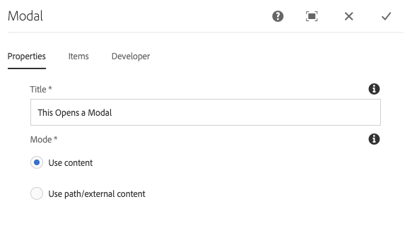
- Title - The title of the modal link
- Mode - Link to a content page within AEM, an external resource, or an anchor
- Use Content - Display one or more components in the modal.
- Use path/external content - Display content from another page.
Items Tab
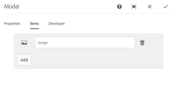
- Title - The title of the modal item
Copyright © 2025. All rights reserved. Informa Markets, a trading division of Informa PLC.